Before
aesthetics,
there is decision.
A method to build accurate and lasting identities.
Clarify & decide
Before drawing a single line, we immerse ourselves in your brand’s world.
We analyze your values, ambitions, and inspirations to reveal a clear and meaningful direction.
This is where everything begins:
where an idea takes shape
and your vision starts to materialize.


This phase includes:
– Workshops and strategic discussions to understand who you truly are.
– Moodboards and creative research to explore possible visual territories.
– Visual positioning work to define how and where you want to be perceived.

Translate & activate
Once the direction is clear, it must be made legible. Visible.
Consistent, everywhere.
This phase consists in translating the decisions made into a precise and controlled visual system.
Every element is designed to serve the defined position, without gratuitous effects or unnecessary decoration.
Here, design is not a layer.
It is a language.
A tool to assert, structure, and deploy your brand in the real world.
The goal is not to multiply touchpoints, but to ensure a fair, recognizable, and lasting expression, whatever the point of contact.
This phase includes:
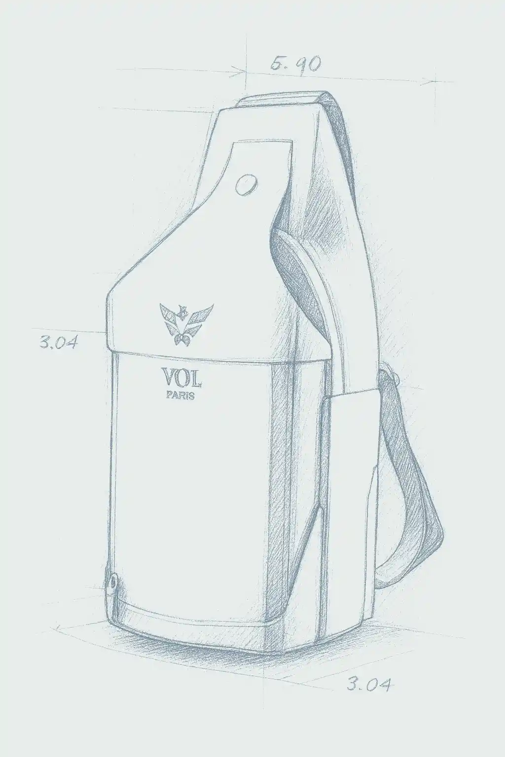
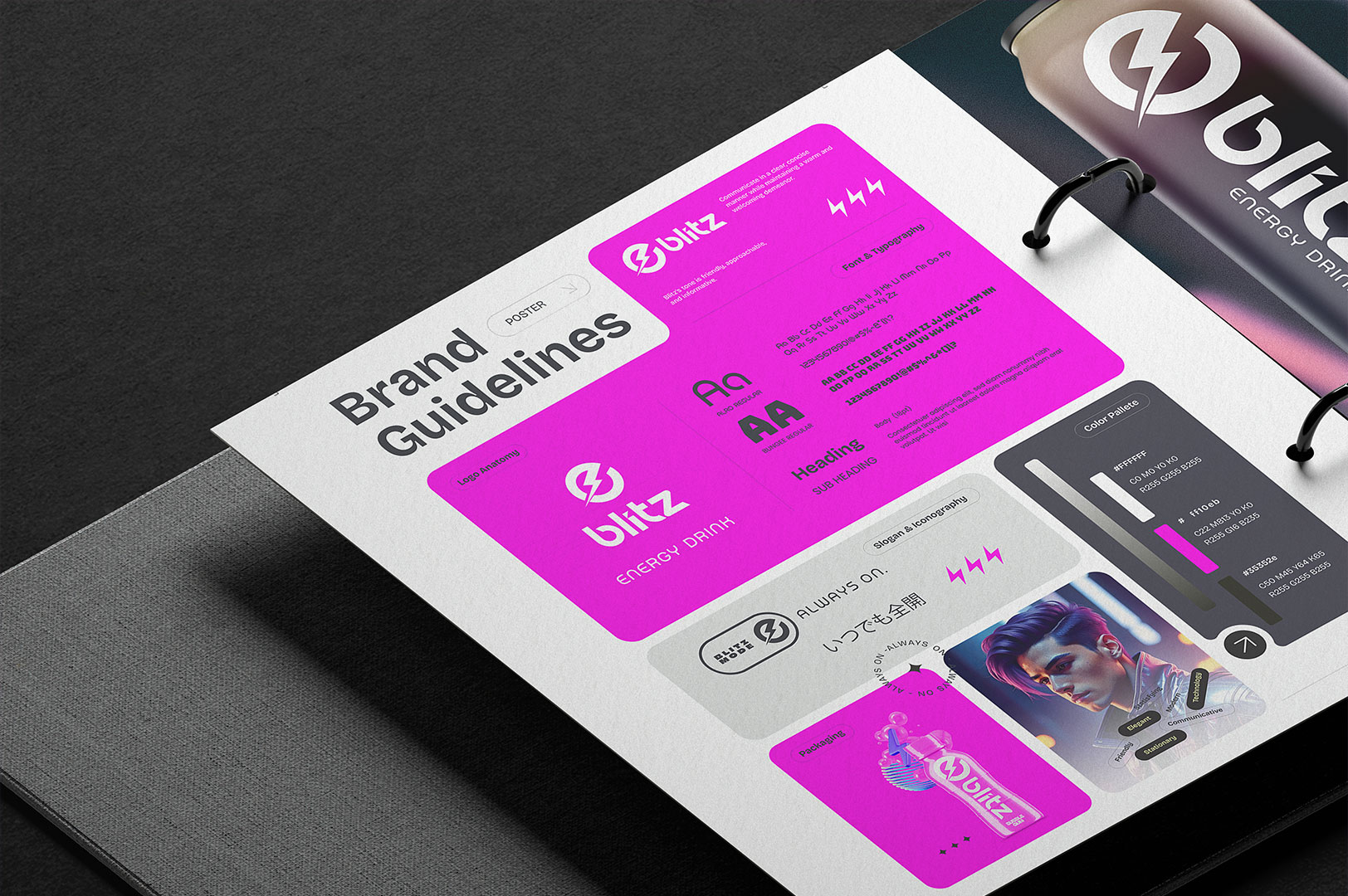
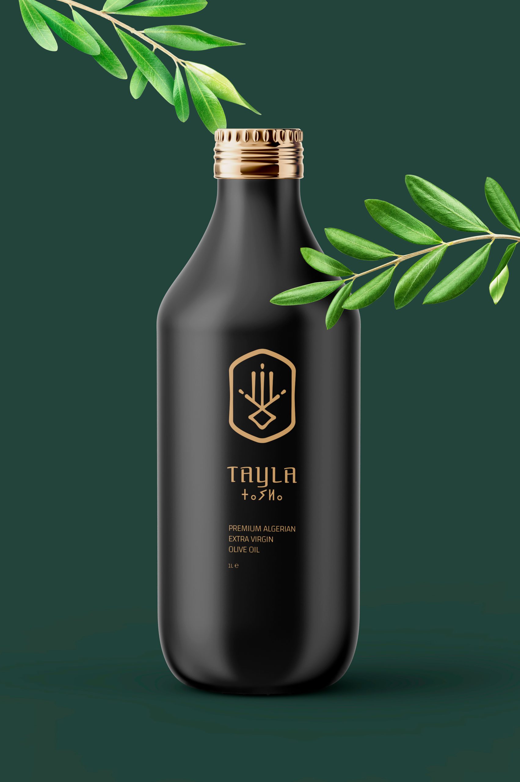
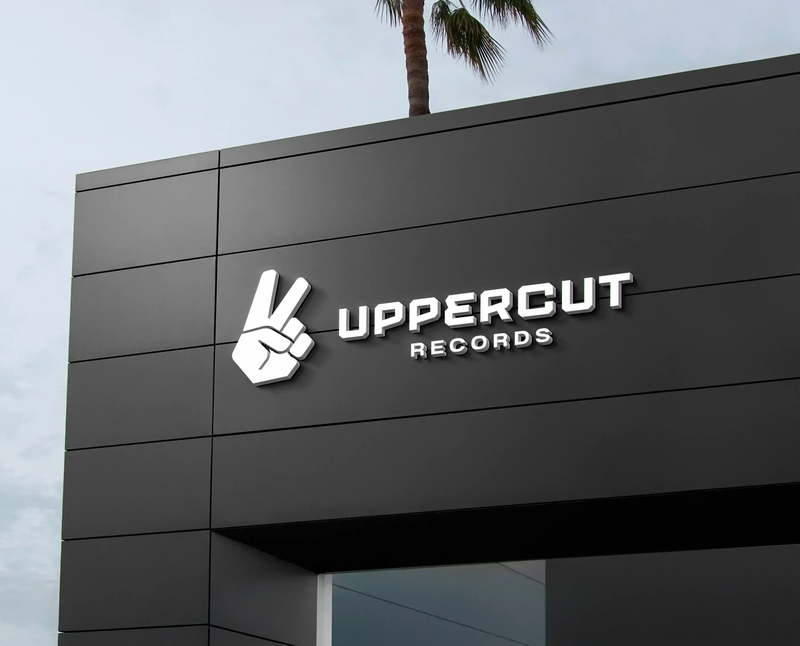
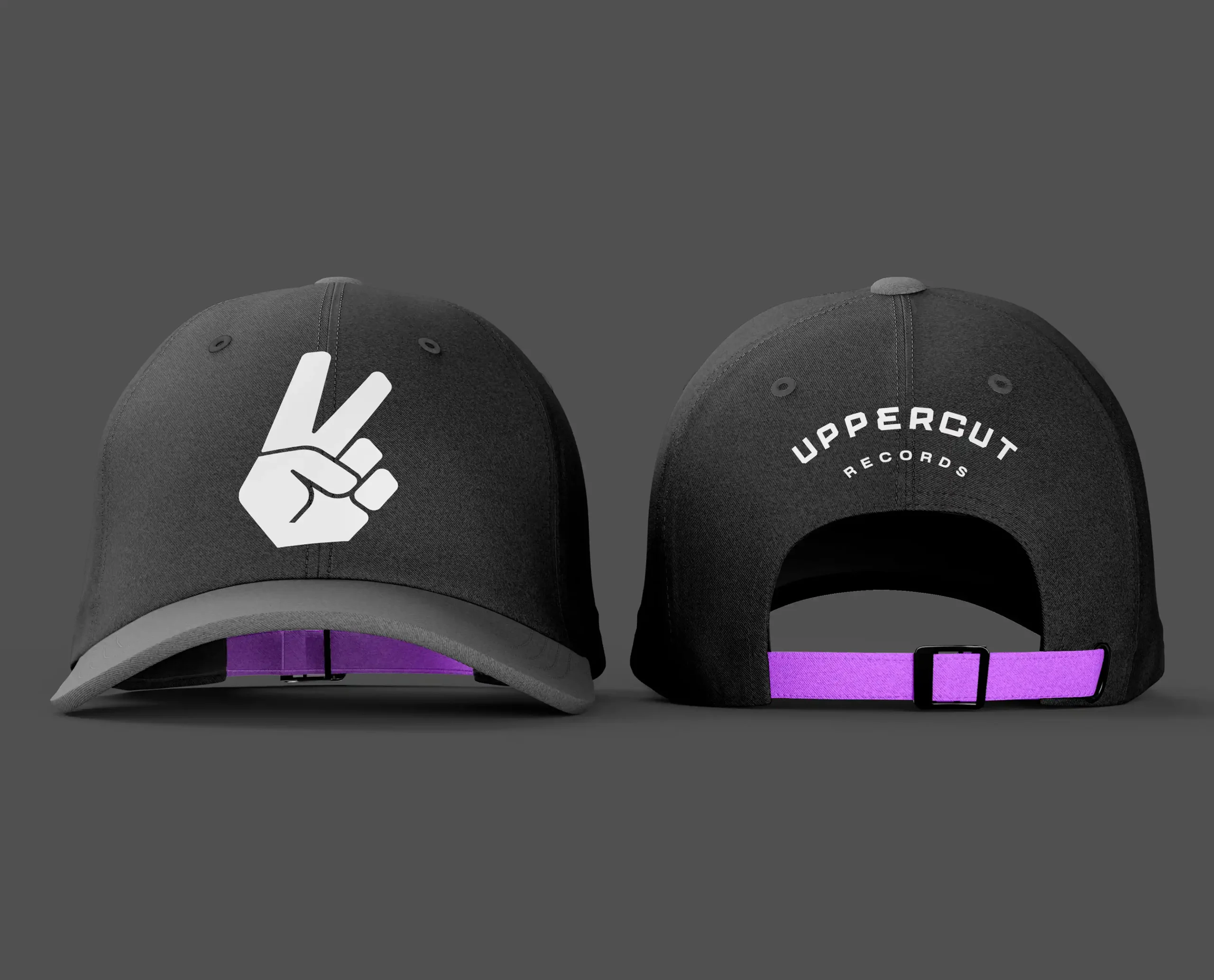
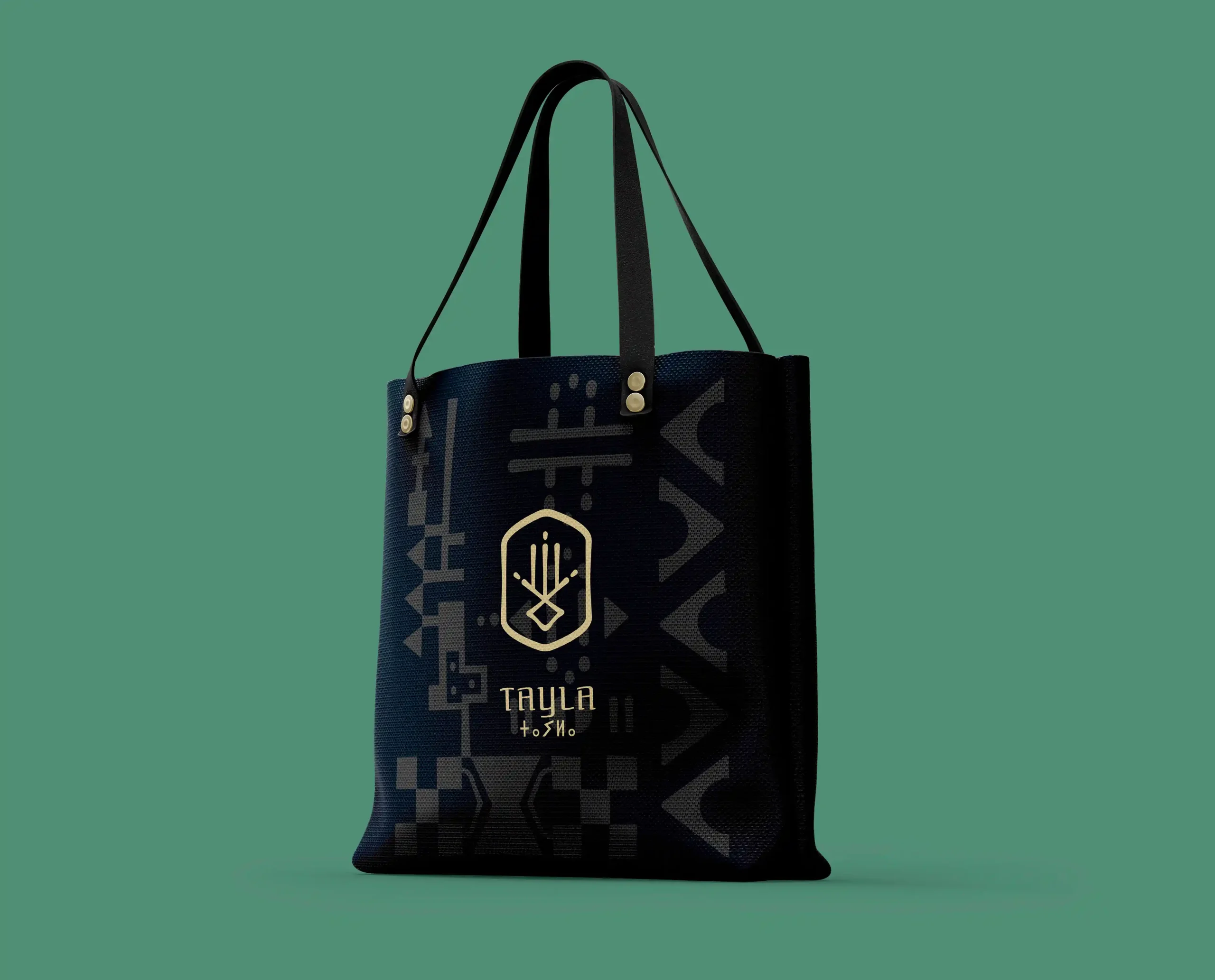
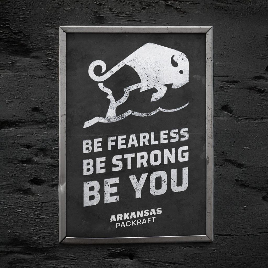
– The creation of the visual identity and its foundations (logo, typography, colors, rules).
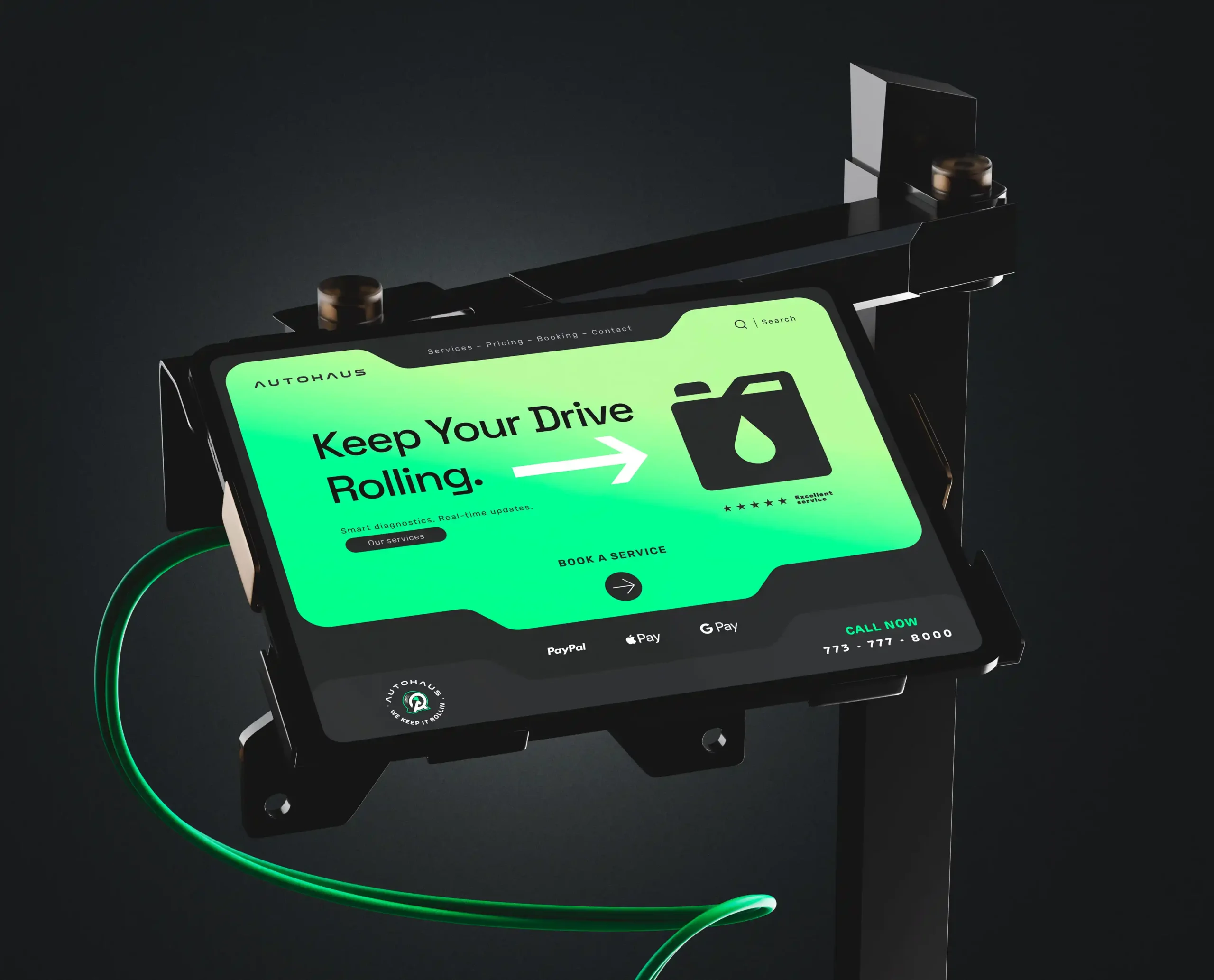
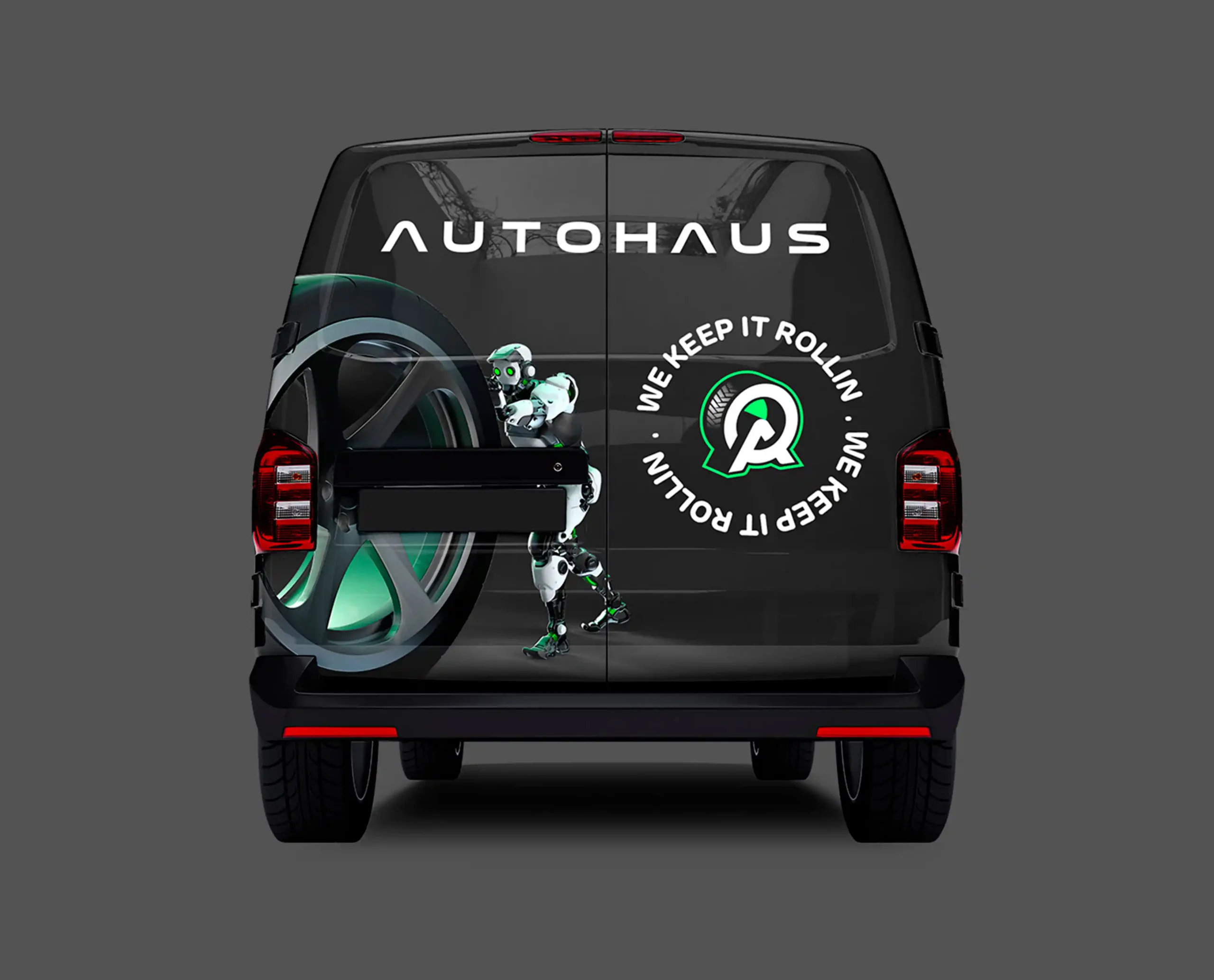
– Adaptation across the necessary touchpoints: digital, print, products, environments.
– The establishment of a clear framework to ensure consistency and long-term autonomy.
Collaboration is built
on simple and precise principles:
1. Meaning before style.
2. Listening before action.
3. Emotion as the guiding thread.
4. Collaboration above all.
5. Details make the difference.
6. Embrace simplicity.
7. Authenticity as a signature.
8. No creativity without boldness.
9. Inspired by everything, everywhere.
10. Always in motion.
Sofiane (YA²)
Senior Brand Designer
Brand direction & positioning
I step in when identity becomes a strategic decision,
not decoration.
Not an executor. Not a consultant.
Creative Partner.
I frame. I decide. I lead. I design.
Design doesn’t decorate.
It makes choices visible.

When strategy becomes felt.
A strong identity is not limited to being beautiful.
It is legible, consistent, and immediately recognizable.
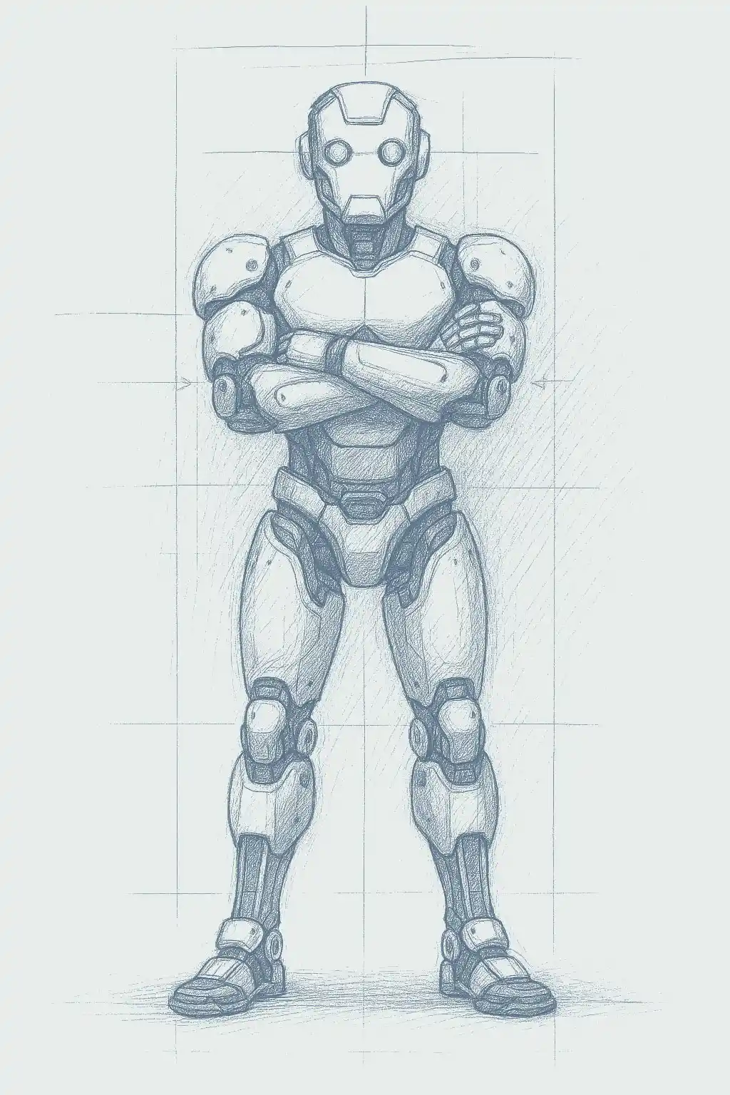
FEEL IDENTITY™ is an approach that connects creative intuition with strategic rigor. It may occasionally rely on artificial intelligence tools to explore, test, and refine, always under human and creative direction.
It helps clarify a vision, extract what truly matters, and translate it into a fair, lasting, and memorable identity.
Every choice is intentional.
Every detail serves meaning.
Nothing is decorative.

VISUAL IDENTITY
COHERENT & RECOGNIZABLE
DESIGNED TO FRAME
EXPRESSES AN IMAGE
ONE-WAY COMMUNICATION

LEGIBLE & MEANINGFUL
DESIGNED TO POSITION
CARRIES MEANING
TWO-WAY COMMUNICATION

FEEL Identity™
ALIVE & EMBODIED
DESIGNED TO BE FELT
EXPRESSES AN INTENTION
CONTINUOUS INTERACTION
1. A BRAND
DRIVEN BY A VISION

ENGAGEMENT

WITH MEANING
4. CONSISTENCY
AND CONNECTION
5. A GRAPHIC SYSTEM
DESIGNED TO ADAPT
6. RELEVANCE
IN CONTEXT
7. STRUCTURE
AND OWNERSHIP
8. A CLEAR
AND CONFIDENT VOICE
9. EVOLVE
AND INNOVATE
10. BUILD
A GLOBAL COMMUNITY
How identity
takes shape
A relevant identity is not created all at once.
It is built through successive iterations, between strategy, creation, and adjustment.
The work is structured around five essential stages, enriched when necessary by analysis and exploration tools that help refine the accuracy of decisions, without ever losing sight of the original intent.
1. EXPLORE
Understand the brand’s DNA, tensions, and true intent.
2. DEFINE
Clarify a clear strategic and creative vision.
3. DESIGN
Translate this vision into a coherent visual and verbal language.
4. EXPERIMENT
Test, refine, confront variations, and remove what is unnecessary.
5. ACTIVATE
Deploy a living identity, designed to last and evolve.
"Design is where science and art break even."
Robin Mathew
"Design is where science and art break even."
Robin Mathew
Simplicity
as a universal language.
A strong identity is not built by adding more, but by removing everything that obscures what truly matters.
En révélant la justesse d’une marque,
By revealing a brand’s true clarity,
its impact becomes immediate, lasting, and readable everywhere.
A minimalist approach that enables:
Immediate understanding.
Lasting memorability.
Total adaptability.


Build a brand
that makes sense
and lasts.
A brand is no longer just a product.
It is an experience, a relationship, a presence over time. Every shape, every color becomes a silent language. A way to express values, build attachment, and establish trust.
The approach combines design and strategy to build identities designed for the long term:
A coherent visual narrative — what is understood and remembered.
A meaningful emotional resonance — emotion builds trust before reason.
True durability — an identity able to evolve without betraying itself.
A brand identity is not a one-off project.
It is an investment.
Surprise,
with precision.
Boldness is not decorative; it is a strategic decision.
In a saturated environment, difference only has value when supported by a clear framework.
A distinctive visual language captures attention, asserts status, and anchors the brand over time.
Designed to live and evolve, a strong identity remains consistent from digital to physical, from static to motion, without ever becoming fixed.
Every choice is measured: no gratuitous risk, only those that serve positioning, legibility, and longevity.

Feel Identity™
The balance
between intuition and structure.
An identity is not only understood. It is felt. Shapes, colors, and rhythms express a vision even before words.
What is explained is forgotten.
What is felt endures.