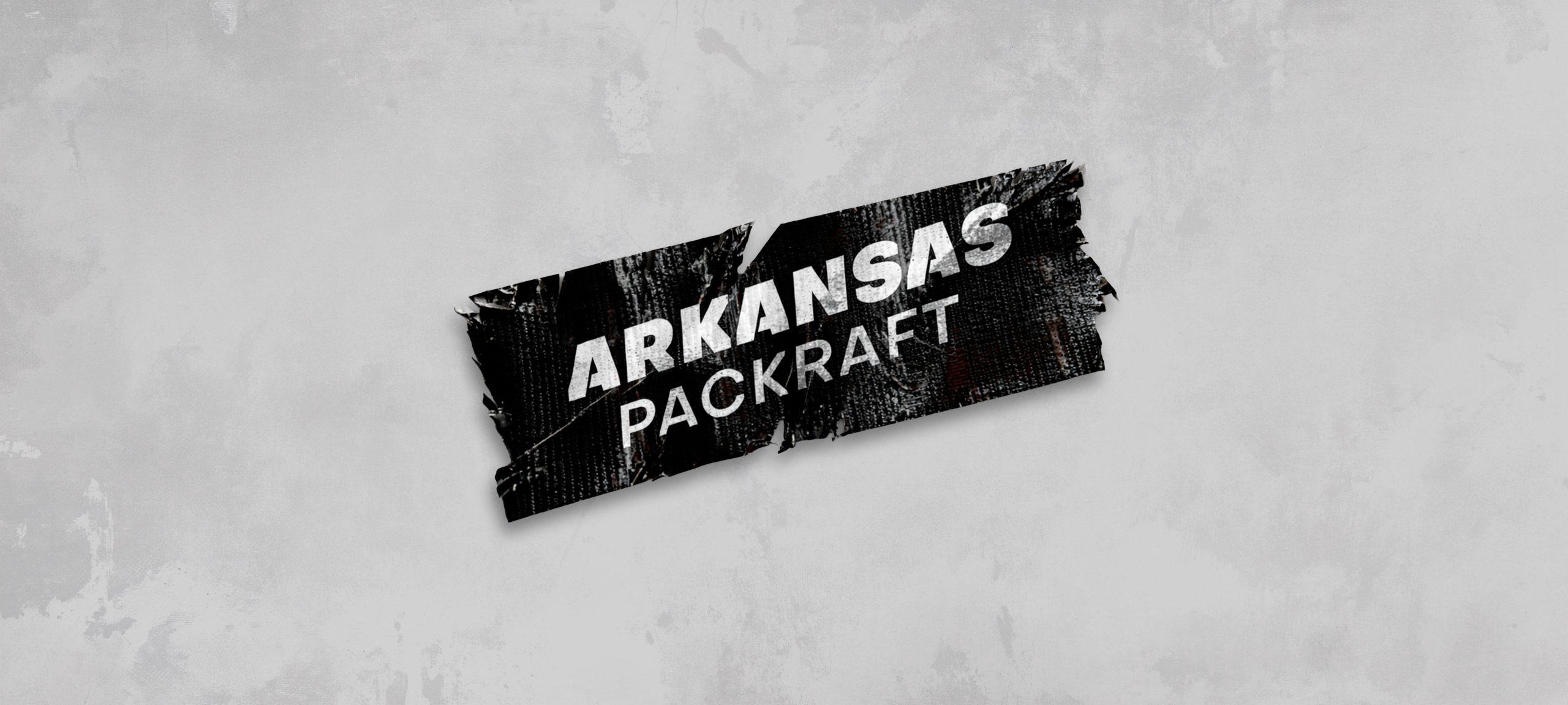
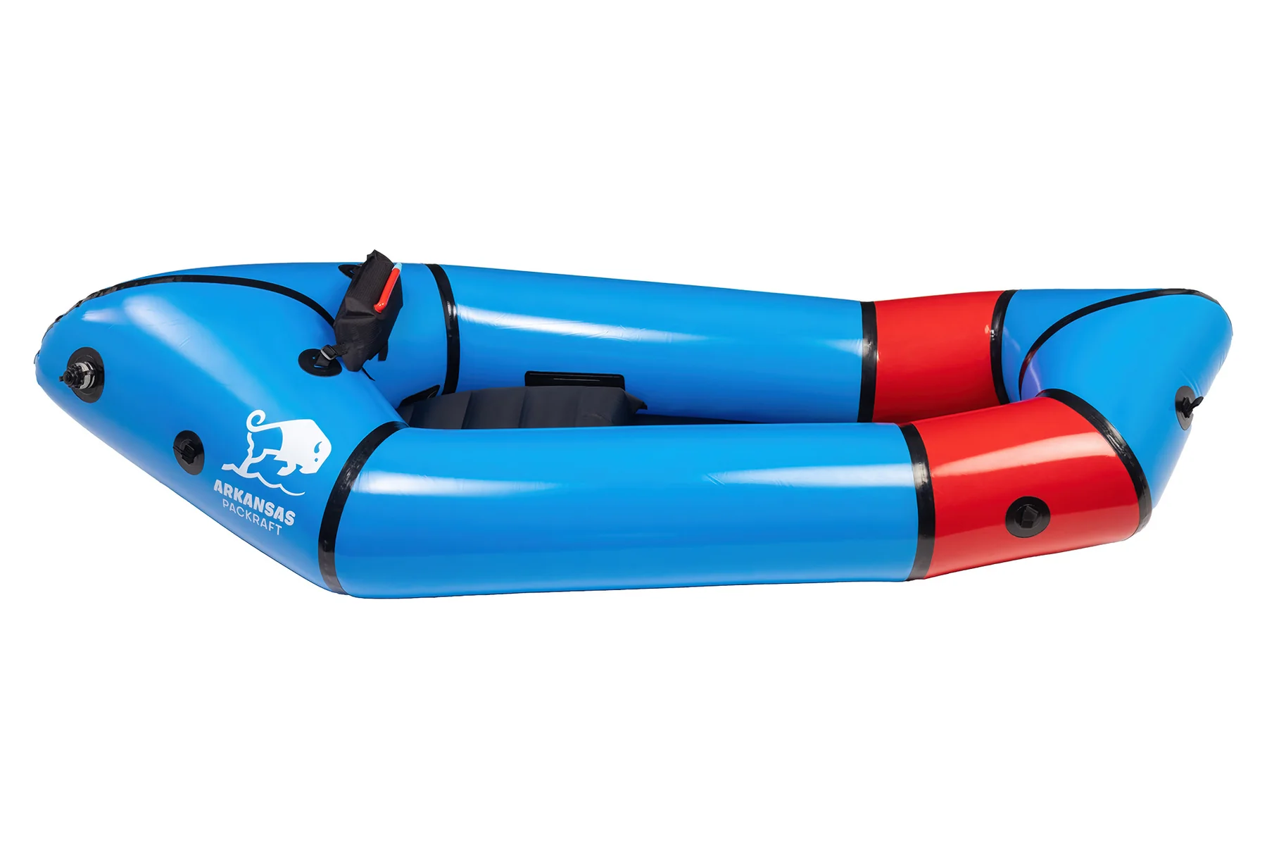
Arkansas Packraft.
Turning an outdoor brand into a symbol.
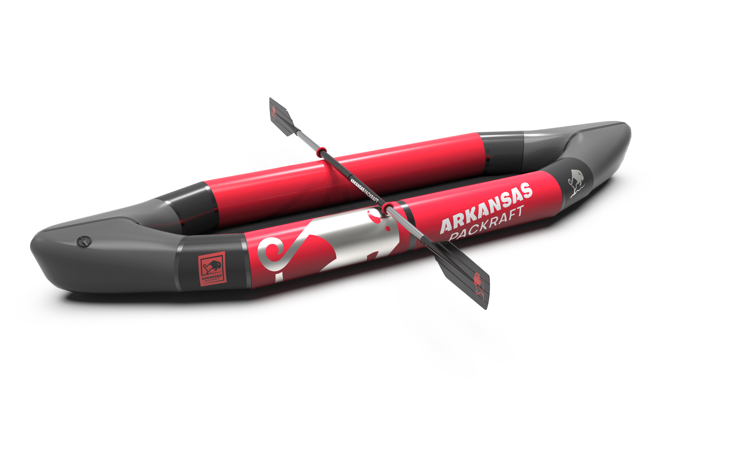
A reliable, high-performance product.
But a brand without a clear point of reference.
Problem
A solid product.
No real anchor.
Low recognition.
Decision
Root the brand in its territory.
Create a distinctive symbol.
Build a clear foundation.
Impact
The brand takes shape.
It becomes recognizable.
It gets adopted.
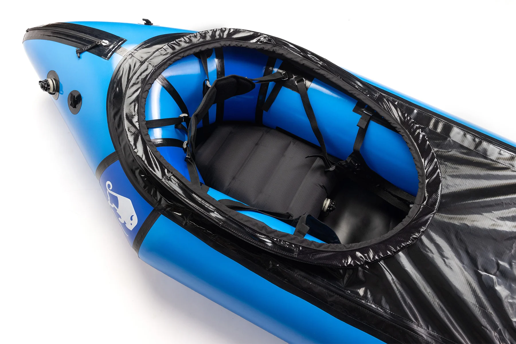
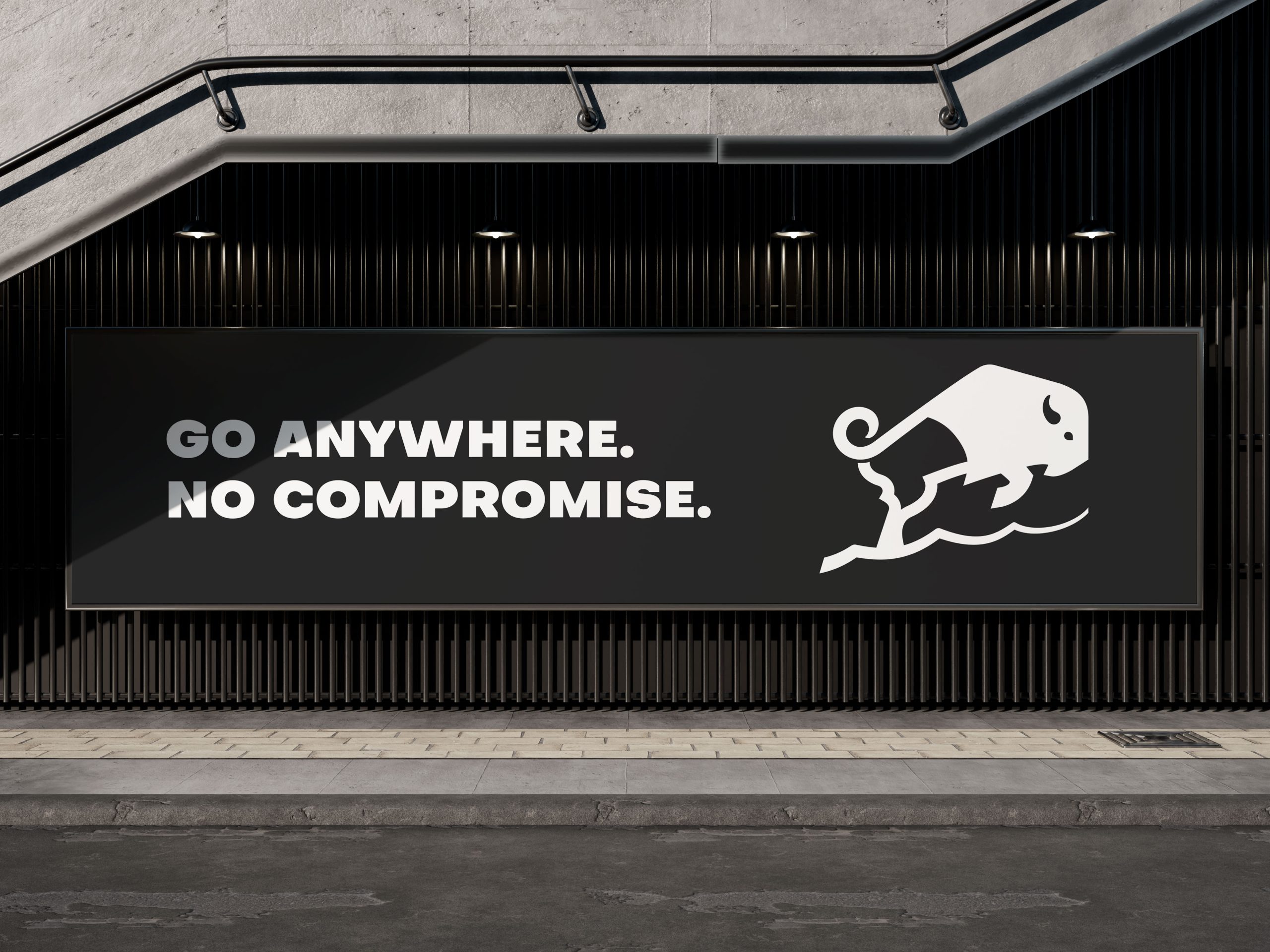
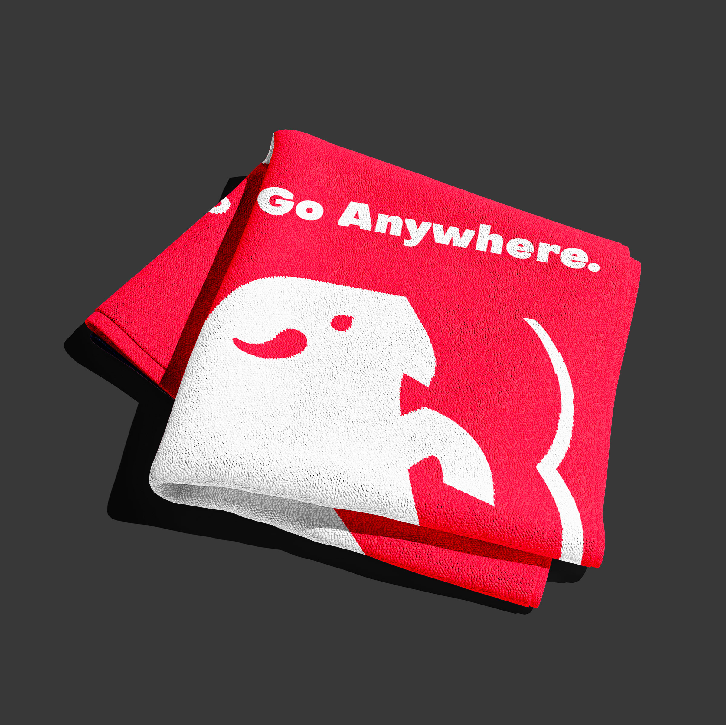
A symbol rooted
in its territory.
The bison is instantly recognizable.
It adds meaning without adding noise.
The brand builds on an existing cultural cue.
It becomes more direct.
More legitimate.
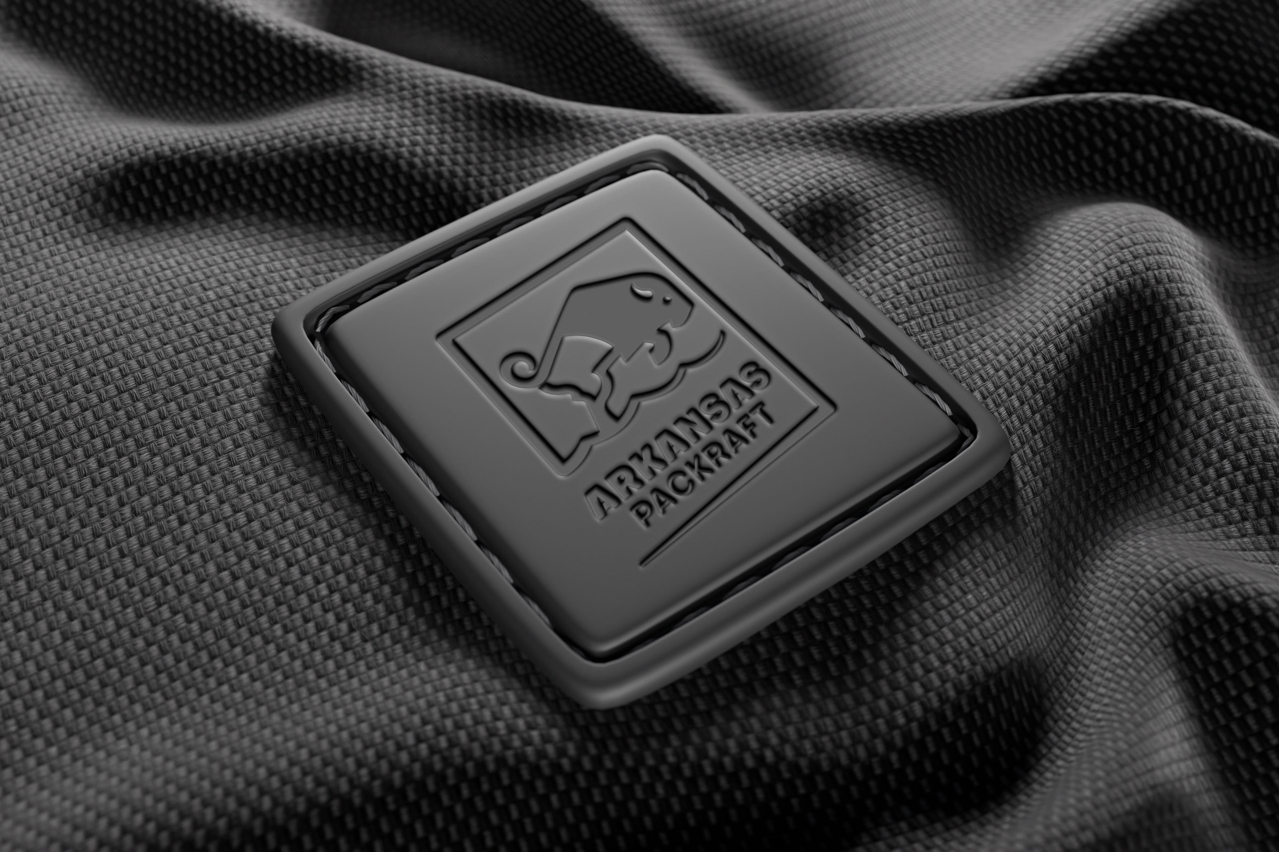
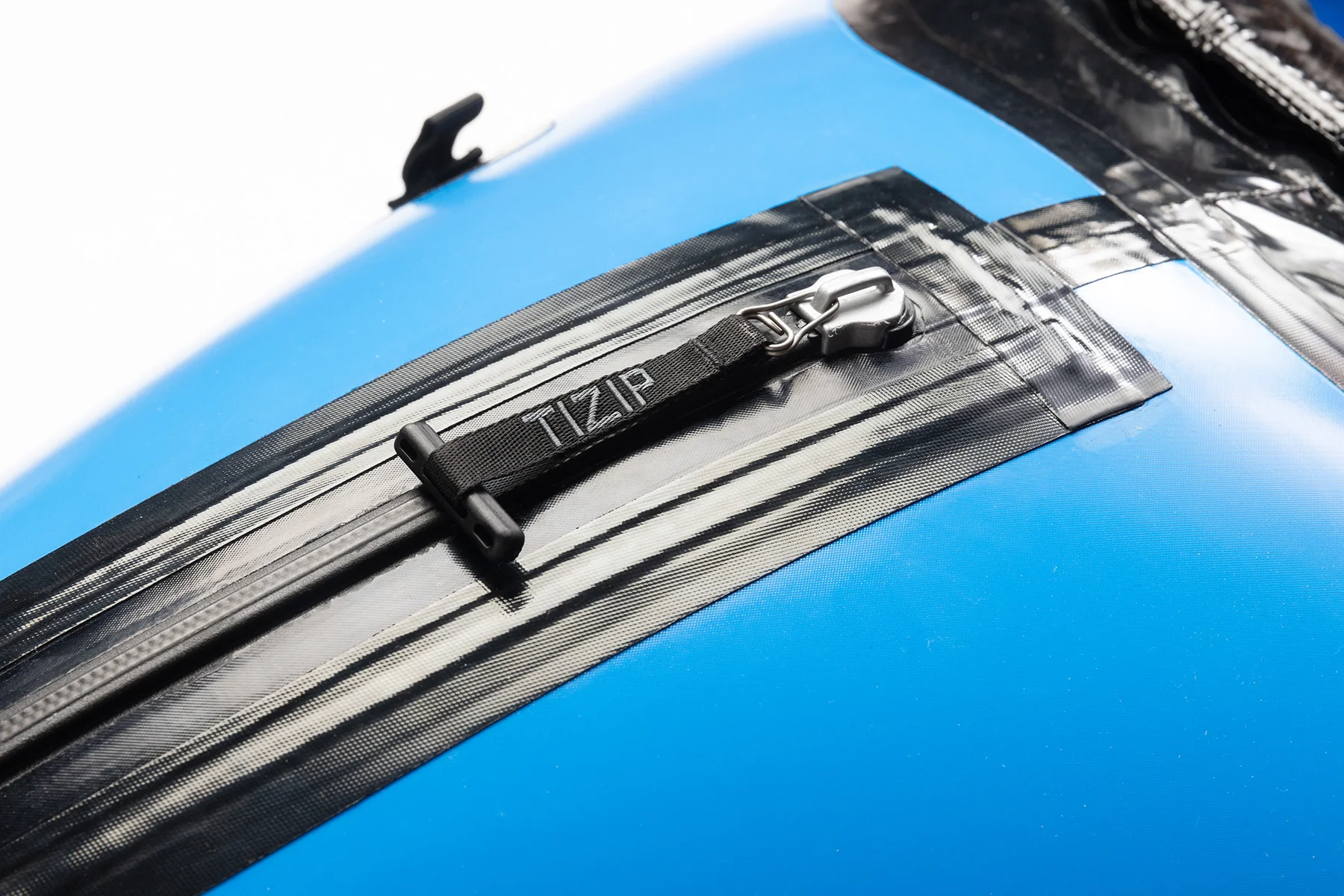
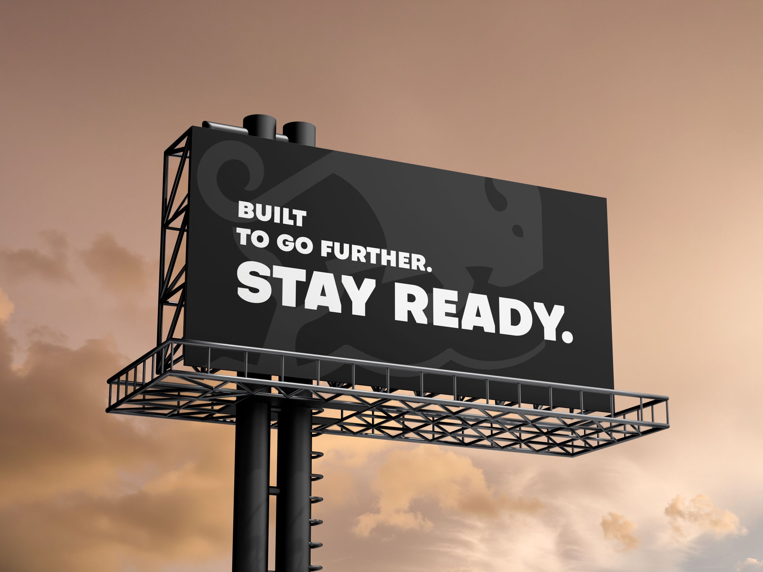
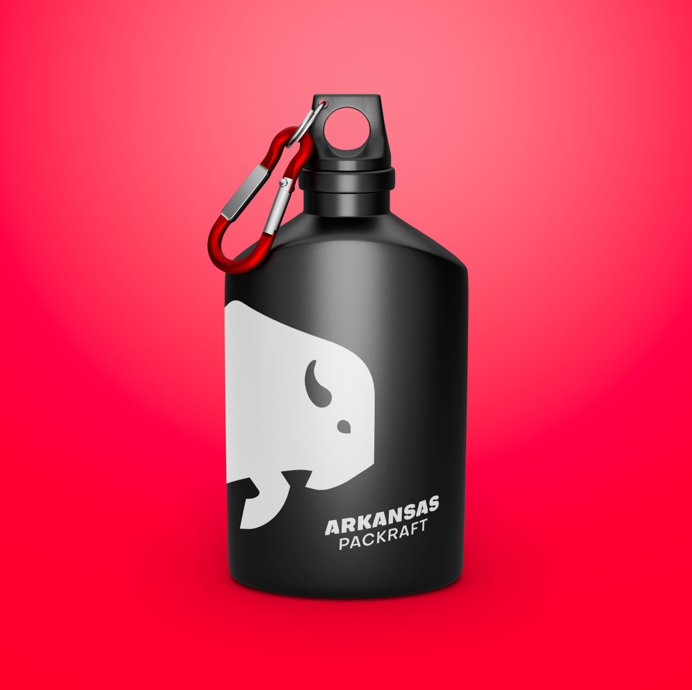
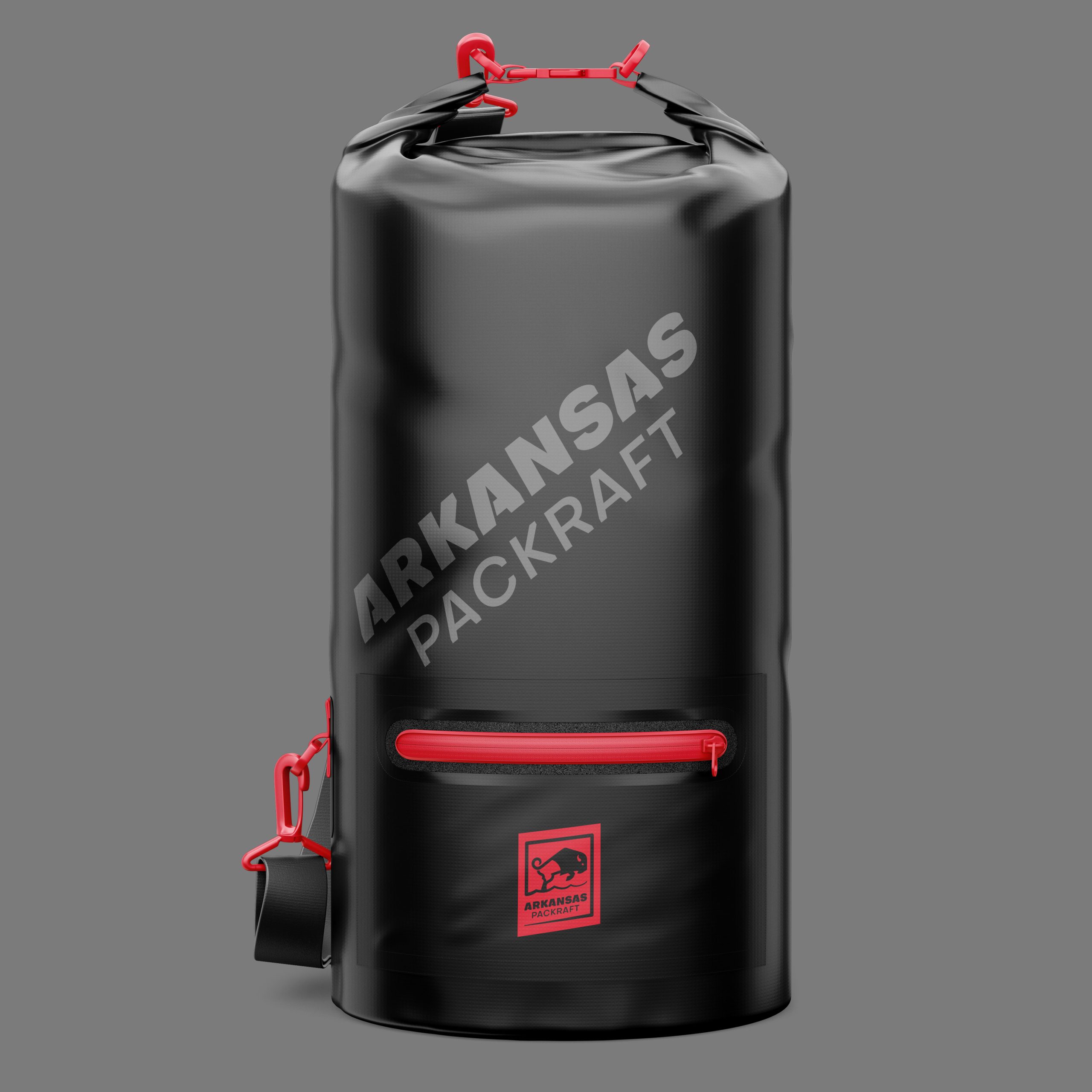
A simple mark.
Built to last.
A clear form.
Strong contrast.
It works across every touchpoint
without losing clarity.

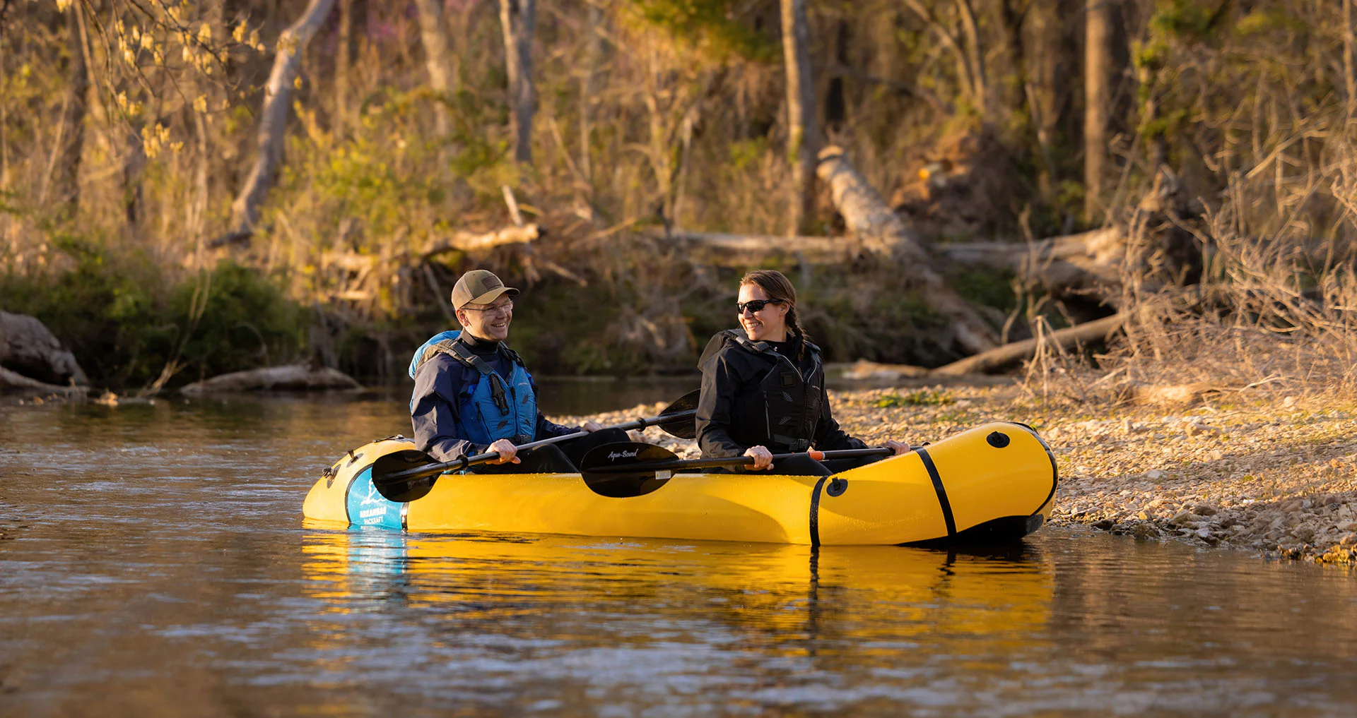
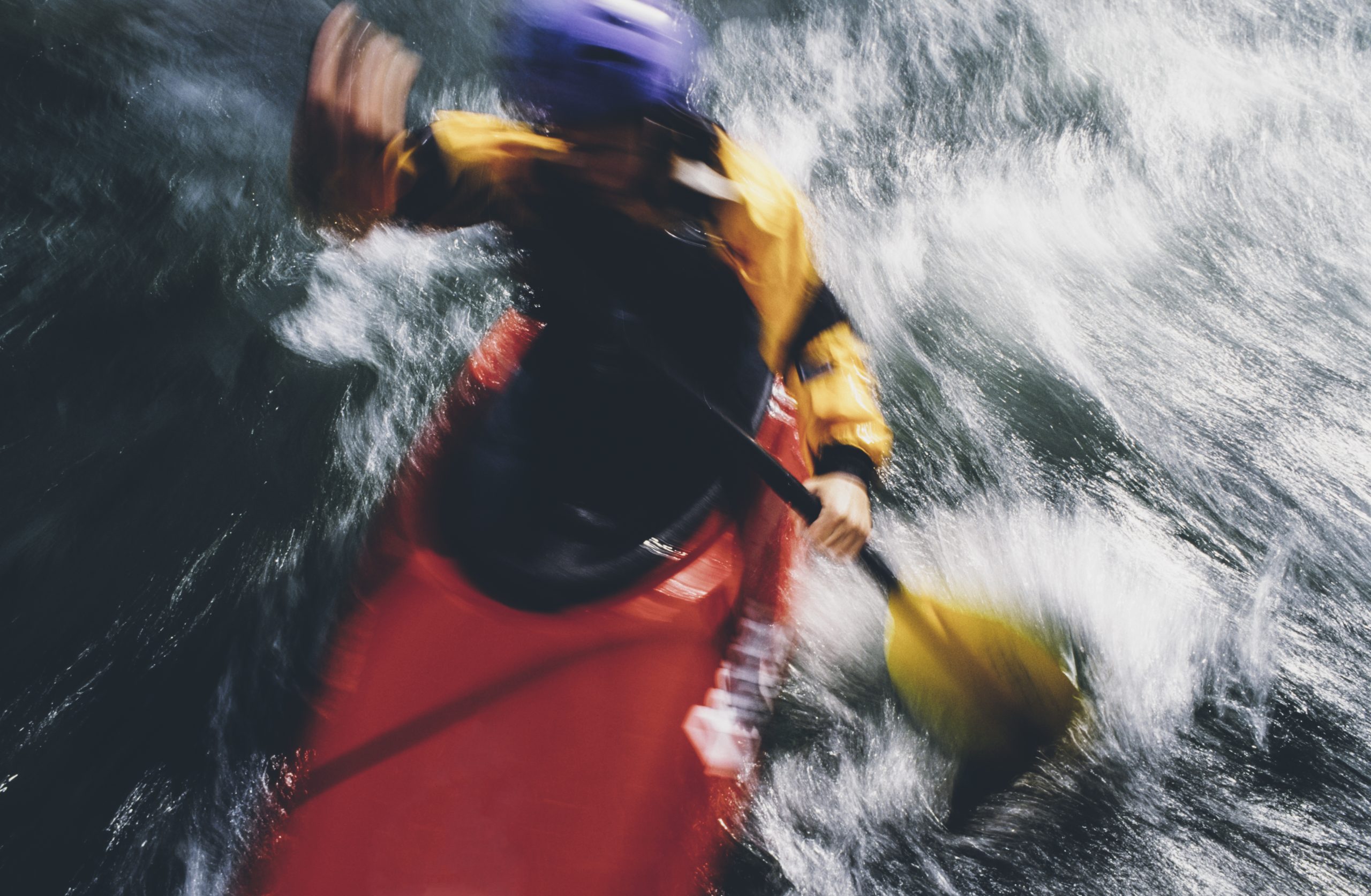
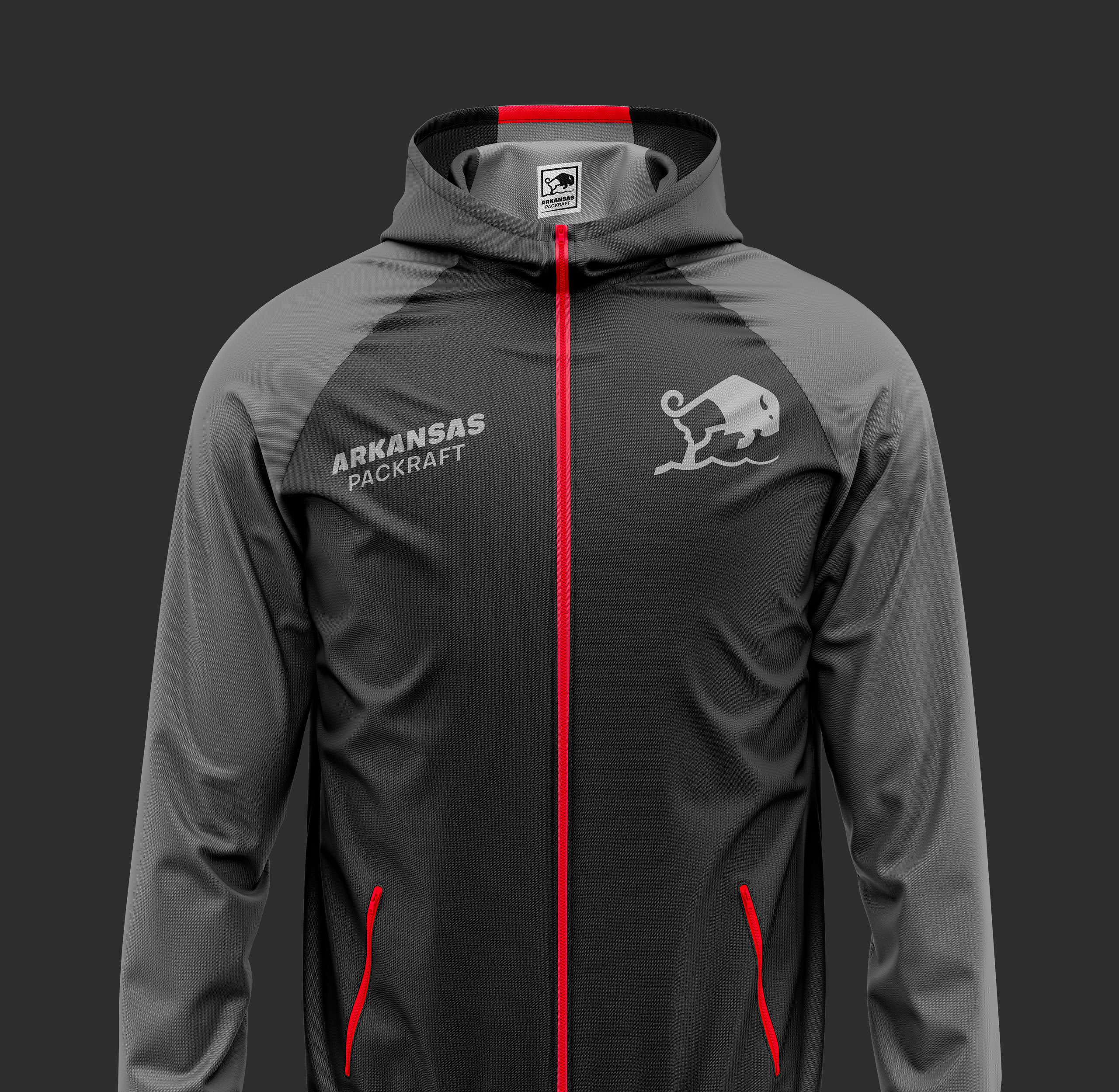
A brand that moves.
The product is in motion.
The brand follows without friction.
It stays readable, in every situation.
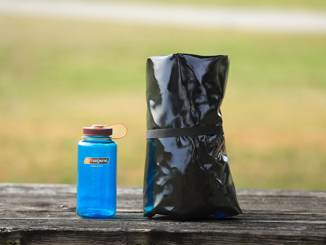
A brand designed for the outdoors.
It integrates into real environments.
It supports actual use.
It doesn’t rely on a single context.
It adapts.


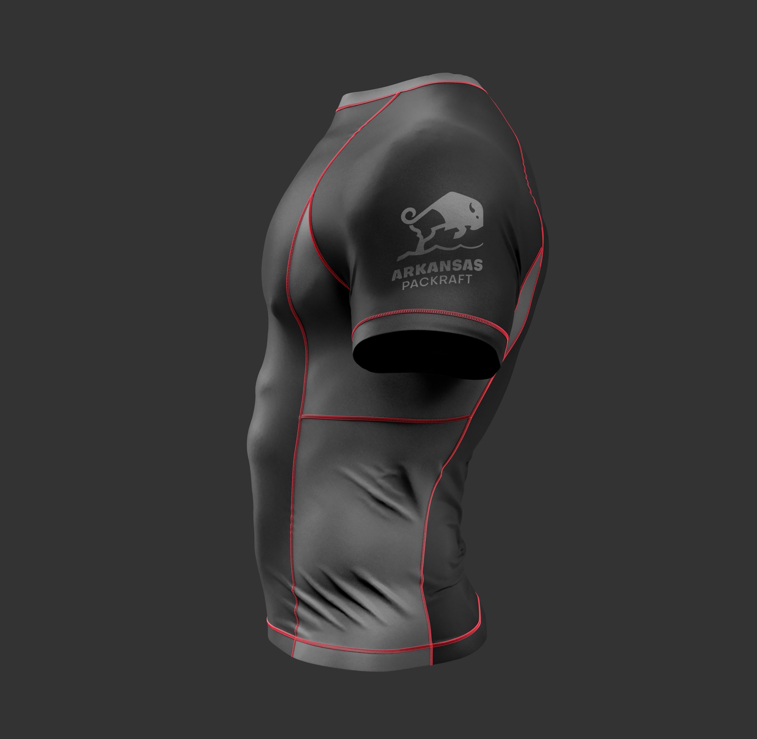
Typography
& brand language
The typography is direct.
Dense. Legible. Uncompromising.
It doesn’t try to seduce.
It states.
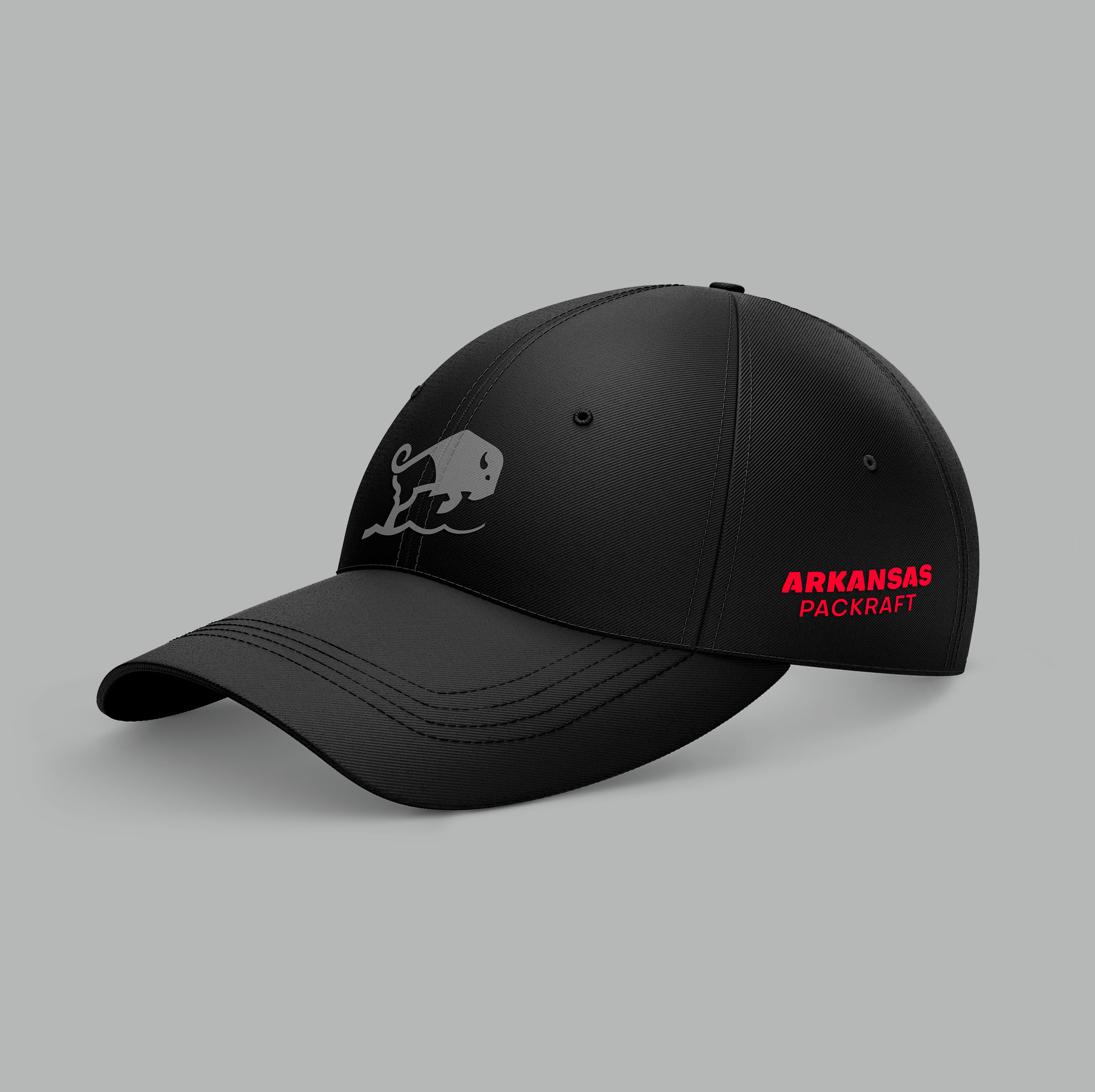
A system
ready to scale.
The system is simple.
It evolves without dilution.
The brand stays consistent,
across every medium.
The brand
settles in.
It asserts itself in the environment.
It becomes a landmark.

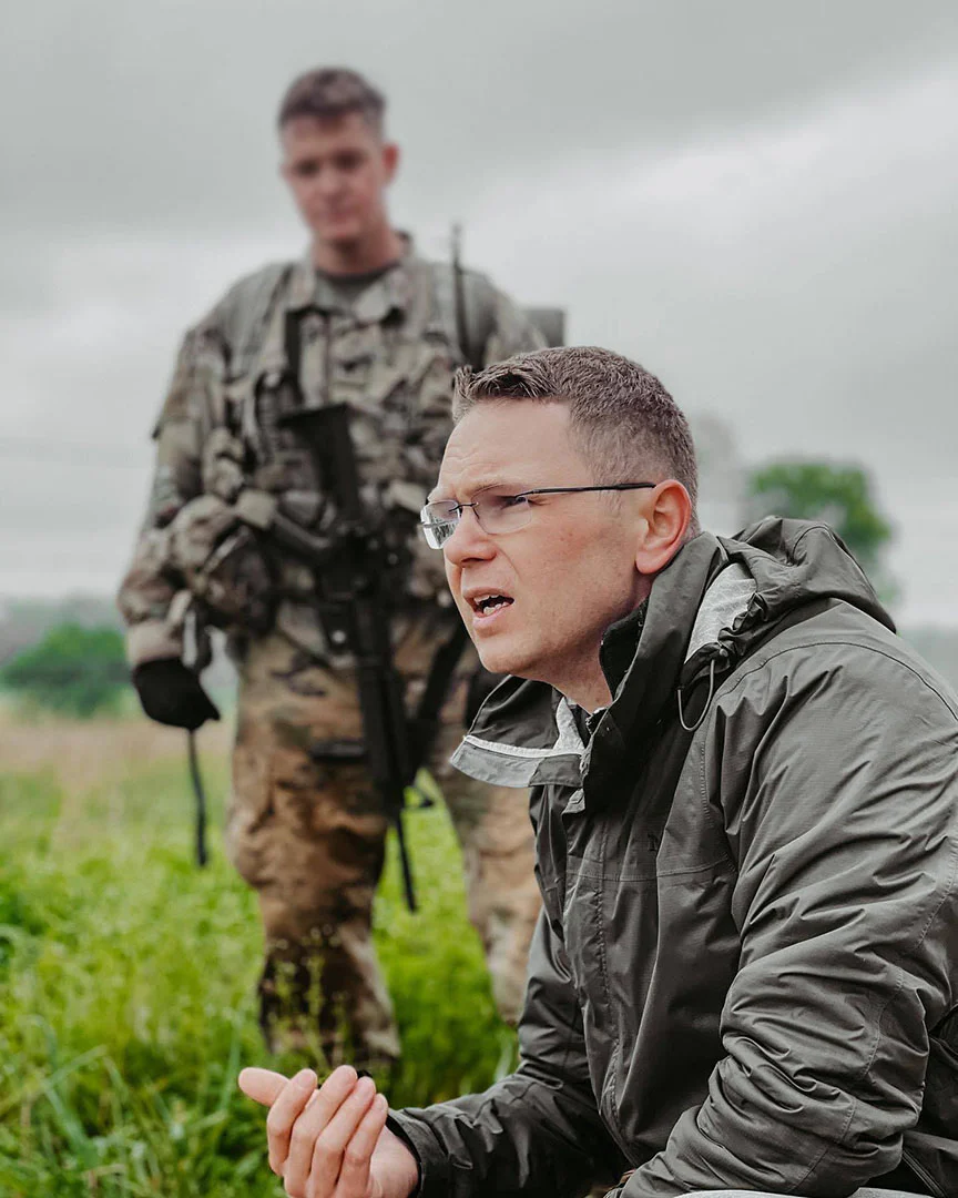
We don’t build for ideal conditions. We build for what actually happens out there.
Michael Barnett, Founder