AUTOHAUS / TIRES & SERVICES
AUTOHAUS / Identity
Client:
AUTOHAUS CHICAGO
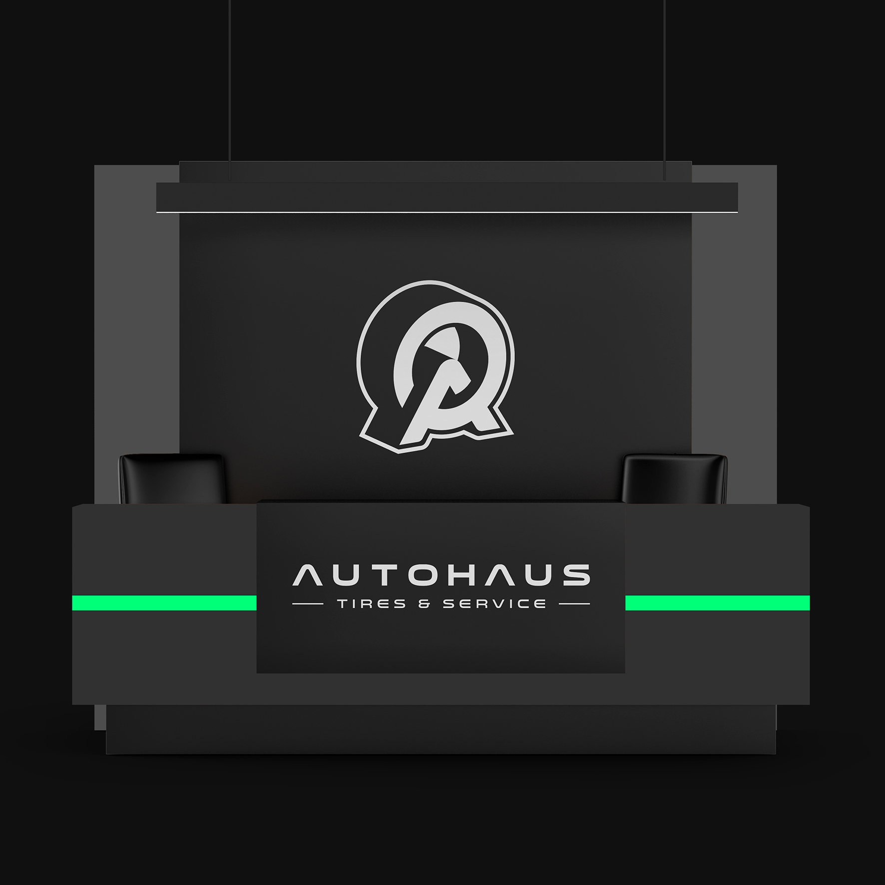
Rebranding project for Autohaus, a car repair shop in Chicago. In a category crowded with symbols such as wrenches and cars, the garage needed an identity that would stand out. We designed a unique, bold and distinctive logo consisting of the letter «A» to refer to the name of the company and a tire, as this is the main service provided. The neon green combined with black gives a real a touch of modernity.


[unex_ce_button id="content_pxtu4jdwv,column_content_udffe4ik6" button_text_color="#ffffff" button_font="light" button_font_size="84px" button_width="auto" button_alignment="center" button_text_spacing="2px" button_bg_color="transparent" button_padding="0px 15px 15px 15px" button_border_width="0px" button_border_color="transparent" button_border_radius="0px" button_text_hover_color="#00ffbb" button_text_spacing_hover="2px" button_bg_hover_color="transparent" button_border_hover_color="transparent" button_link="https://ya2.design/" button_link_type="url" button_link_target="_self" has_container="" in_column="1"]˿[/ce_button]

